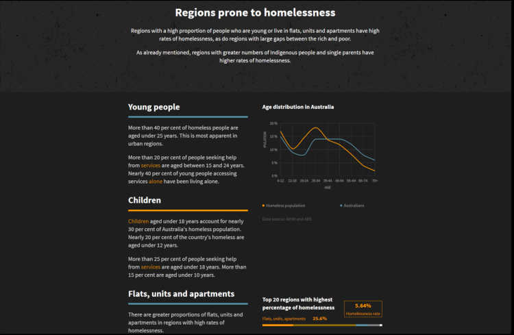
Part of the website combing text and smaller line graphs

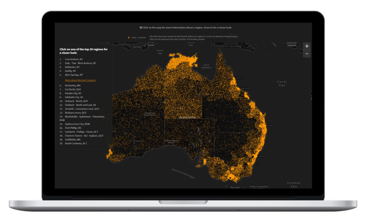
A dot density map showing the geographic distribution of homeless people in Australia
Year: 2015
Provided Service: Interactive Web-Based Reports
Roles: Frontend & Data Vis Development
Tech: CoffeeScript, Backbone, Underscore, Jade/Pug, Stylus, Gulp, D3.js, Mapbox
Company: while working as Data Visualisation Developer at Small Multiples (Sydney, Australia)
Client: FactFile ABC News (Australia)
This project portrays the state of homelessness in Australia. It helps people understand the key findings around this very important social issue.
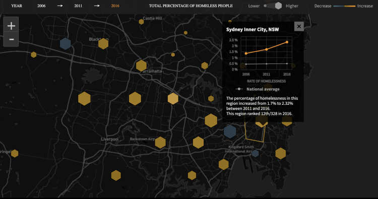
Among other charts, the website includes a dot density map showing the geographic distribution of homeless people as well as a hexbin map depicting the change in the rate of homelessness for different areas in Australia.
The project link above leads to a newer version of the website.
