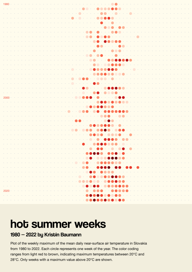
Final visualisation for the Climate Little Picture competition
Year: 2023
Provided Service: Data Art
Tech: Svelte, D3, Python, Figma
“Hot summer weeks” could be the title of last year’s summer pop song on the radio. But also from the year and decade before. And most likely for the next few years as well.
Summer days with very high temperatures and new heat records have become more and more frequent in recent decades.
This data visualization was my entry for the "Climate Little Picture" visualization competition by ESA (European Space Agency).
Method
The visualization consists of circles. Each circle represents one week per year. Years are ordered from top to bottom, as labeled from 1980 to 2022. Weeks are ordered from left to right, with week 1 on the left and week 52 on the right.
The variable shown is the maximum temperature in degrees Celsius in a week, aggregated over the daily mean near-surface air temperatures across the country of Slovakia.
A circle is only shown when the maximum temperature exceeds 20°C. The color coding ranges from light red for 20°C to dark brown for 28°C.
Data
The visualization is based on the data set:
Copernicus Climate Change Service (2020): Climate and energy indicators for Europe from 1979 to present derived from reanalysis. Copernicus Climate Change Service (C3S) Climate Data Store (CDS). DOI: 10.24381/cds.4bd77450 (Accessed on 06-10-2023)
Spatial resolution: NUTS0, temporal resolution: daily
Variable: 2m air temperature in Kelvin (mean area average)
Code
I used the following programming languages and tools: Python & Jupyter Notebooks for data wrangling, Svelte and D3 for visualization as well as Figma for final editing.